
Qoo10: Product Listing Page Redesign
Background: Qoo10, an e-commerce platform founded in 2010, was once a pioneer in Singapore’s online retail industry. However, with the rise of competitors like Lazada and Shopee, Qoo10's prominence has diminished, largely due to a lack of innovation and an outdated user interface.
The Product Listing page is a critical component of any e-commerce platform. It must present essential information such as product overviews, options for selecting variations (e.g., size and model), shipping details, and a clear call to action, like “Add to Cart,” to guide consumers seamlessly through the purchasing process.
Addressing 3 Key Issues
After reviewing the current Product Listing page, I have identified three key issues:
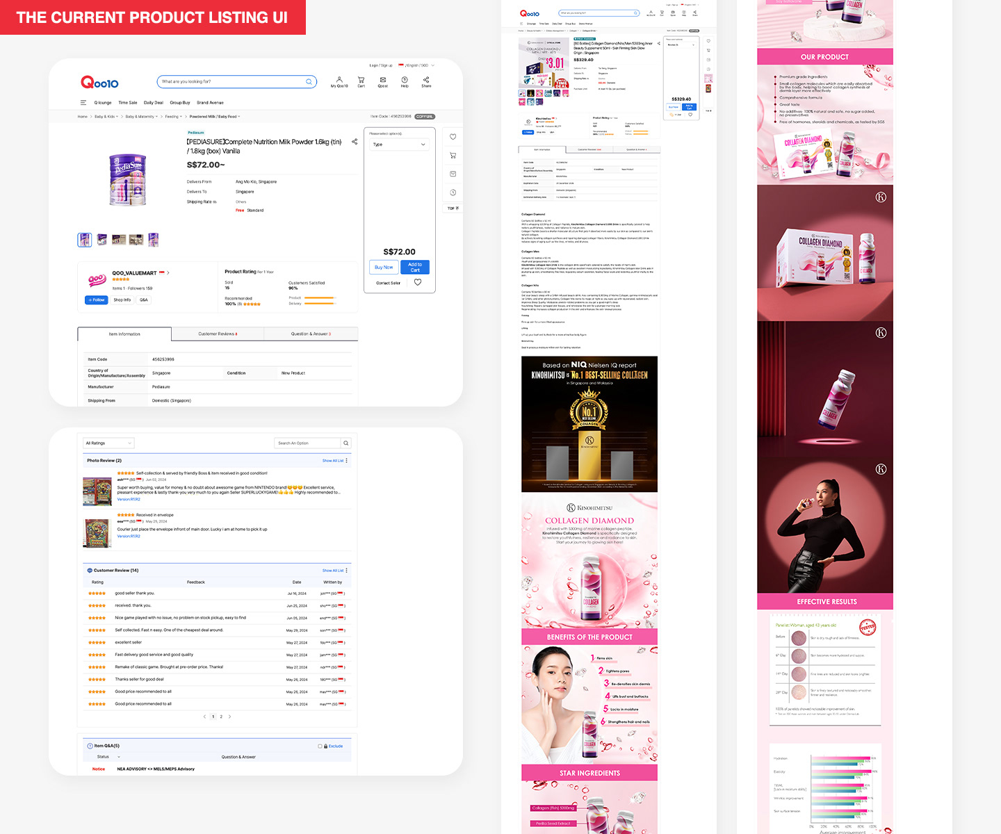
1. Inefficient use of page space: Every pixel counts. The above-the-fold section is critical, as it must instantly communicate key information. Currently, the top of the Product Listing page has excessive unused space and disorganized content. The product variations are hidden in a dropdown list that is placed too far from the main product details. Additionally, the "Add to Cart" button is poorly positioned and lacks prominence.
2. Customer reviews segmentation: The current split between photo and non-photo reviews feels unnecessary. From what I understand, the main incentive for posting a photo review is earning "QPoints," which can be used to offset future purchases. However, the minimal value of these points does not justify dividing the review section, and it complicates the user experience unnecessarily.
3. Overly long product descriptions: There is no limit on the length of the product description section, often resulting in excessive descriptions, sometimes presented as lengthy JPEG images. While visually appealing, these images add little value if they slow down the page loading time. Furthermore, broken images occasionally appear which disrupt the overall browsing experience.
My Redesign
I have maintained Qoo10’s core branding and colour scheme. Beyond addressing the three key issues, I have also redesigned the header area to create a cleaner, more user-friendly look.
1. Product overview: I have streamlined this section by consolidating all relevant details to keep it concise yet uncluttered. Product variations and shipping options are clearly presented, and the most relevant coupon is automatically highlighted, with the option to view more. To simplify the user journey, I have prominently featured the "Add to Cart" button and removed the "Buy Now" option, focusing the user’s action on a single, clear choice.
2. Product description: I suggest avoiding JPEG images in the product description. Instead, the description should be concise and formatted in HTML text for improved clarity and faster page loading. Additional details, such as specifications, can be organized using toggleable tabs, allowing users to access information without overwhelming the layout.
3. Customer reviews: I have merged the photo and non-photo reviews into a single section to create a more cohesive experience. Consumers who include photos in their reviews can still earn "QPoints" as a reward. Additionally, reviews can be sorted by date and filtered by star ratings for easier navigation.
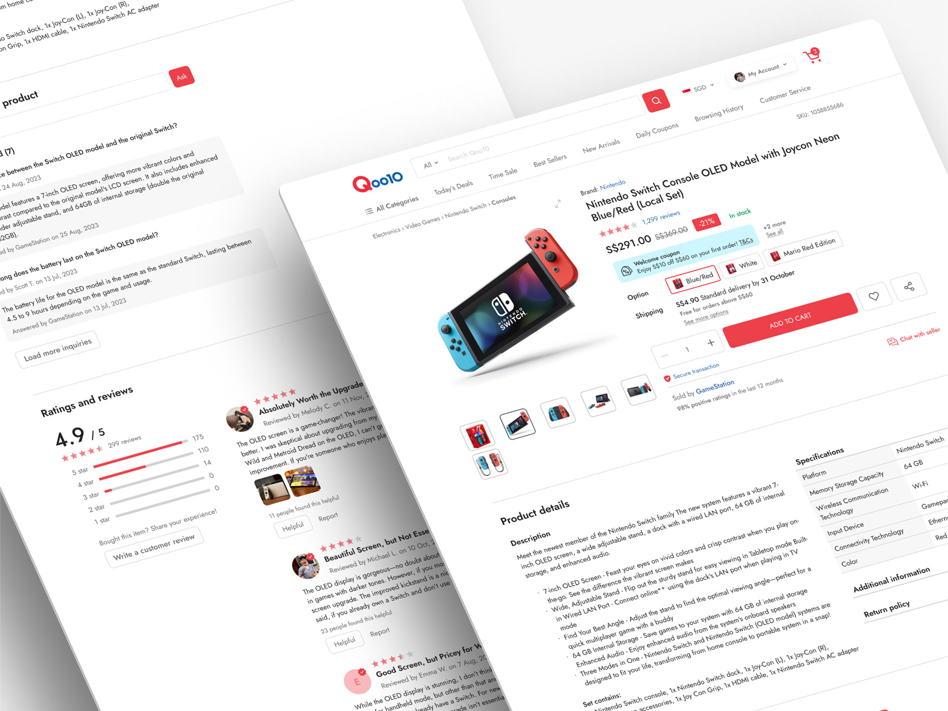

Full desktop page mock-up
Mobile App Version
Designing for the mobile app presents unique challenges. I have aimed to retain most of the elements from the desktop version while optimizing for the smaller screen. To streamline the experience, I have simplified certain sections: shipping options now appear in a dedicated overlay, and product details are collapsed by default to save space. Key actions, like the CTA button and cart icon, are prominently fixed at the bottom of the screen for easy access, ensuring a seamless and intuitive user experience.
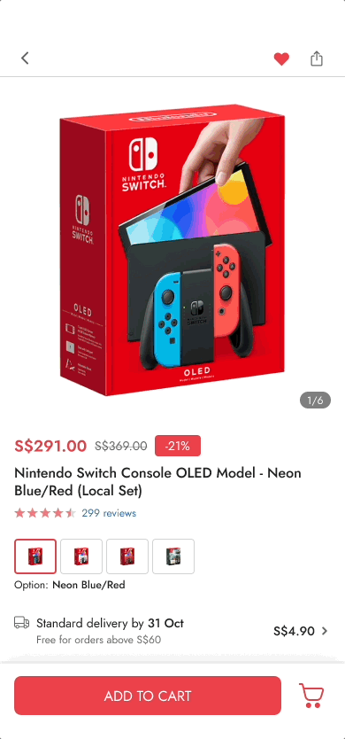
Prototype for the mobile app
